


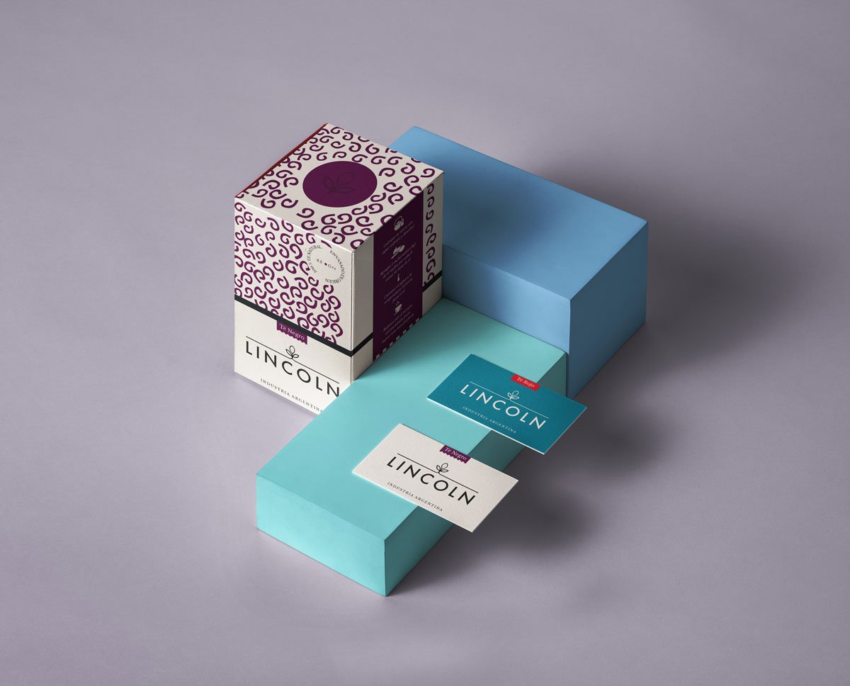
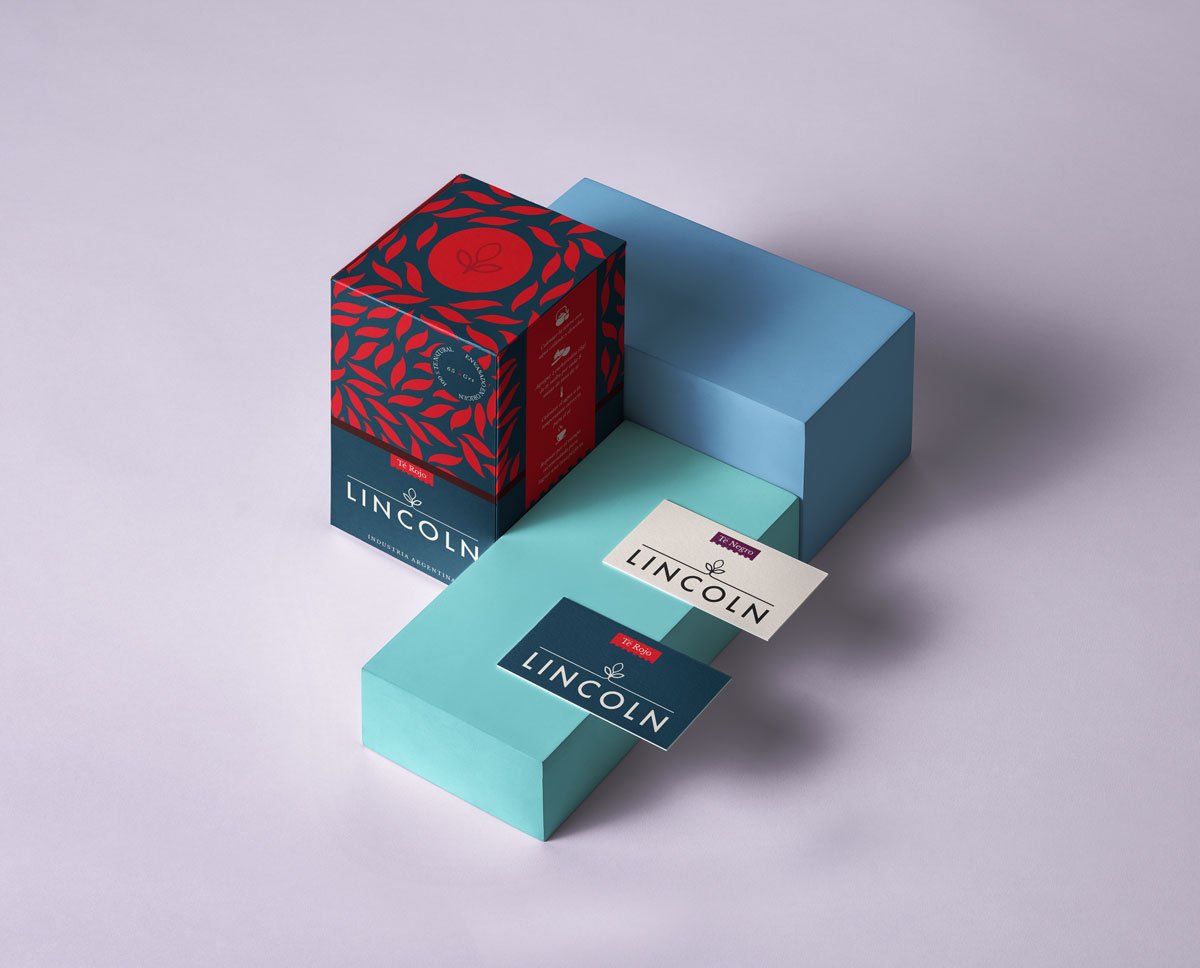
Gabina’s challenge was to revitalize and modernize the LINCOLN brand, with the objective of reinforcing its visual identity.
It was necessary to reduce the verbal weight and increase the visual weight, to create a fresher and more modern communication.
The incorporation of the iconography of the tea leaves, which changes depending on the flavor, has an important role in the design.
It is more representative and catchy, beyond being accompanied by the clarification of its flavor. Through this modernization, it is possible to reach a younger target.

